
MISSION
The Northstar Initiative is a project centered around equitable accessibility to cultural institutions of human expression. With an emphasis on expressive and functional solutions for the betterment of the visually impaired experience.
VISION
Our vision is to increase awareness of the array of perspectives and experiences of visually impaired people, as well as to encourage more holistic & inclusive design thinking.
STORYTELLING
"Northstar" alludes to Polaris, a constant celestial body that has been used throughout time to aid in humanity's exploration of the unknown. Northstar branding takes inspiration from the history of human need. Design has become far more complex, making the solutions to our needs exclusive. Northstar strives to return to the simplicity of our ancestors, to meet the needs of the now, as need does not discriminate like any impairment but crosses all lines and barriers, connecting us to one another since the beginning of human history.
FOCAL POINTS
SUSTAINABLE - Being considerate and responsible does not short change the capabilities of design. Through continued innovation and care, our work can remain sustainable.
ACCESSIBLE - As designers seeking to improve lives, create positive impact, and help people. We must value, implement, and understand what it means to be accessible.
THOUGHTFUL - People matter. It is through continued collaboration with clients and the communites we look to serve that our work remains thoughtful.
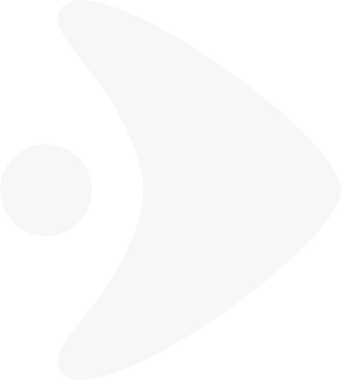
LOGOS
The simplicity of stone age problem solving has inspired our approach to simple but effective problem solving. Replicating simple functionality, the Northstar logo acts as the central tool in which all icons and symbols are built from. There is a megalithic element to Northstars branding as well, pulling from stone formations like Stonehenge or Carnac. The purpose of this being to reference the influence of the celestial body Polaris, as well as give the branding additional space to flex and morph to fit contextual need.

COREMARK

These simple hand tools have been a recording of human history, retelling our evolution as problem solvers and critical thinkers. The oldest stone tools are dated to as far back as 2.6 million years, and through continued evolution, still see use today. These objects were crafted all over the world, meeting the needs of early humans, and remaining reliable throughout human history.
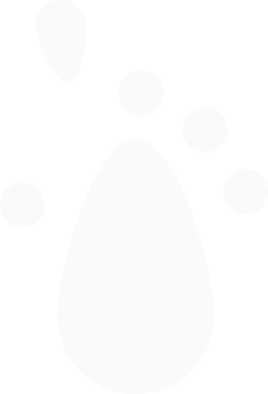
SEEING STONE
Inspired by the form of neolithic tools like hammerstones and hand axes. Receiving its name from the concept of accessing the world around us through an inconspicuous tool.

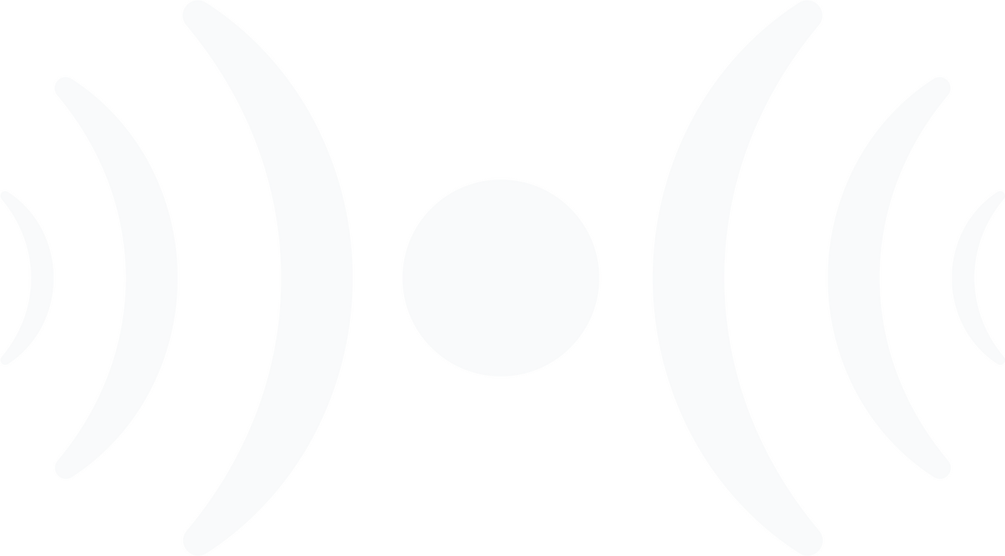
RETICLE
Communicating focus, and guided exploration. The reticle is a calling to those found in optical devices like telescopes.
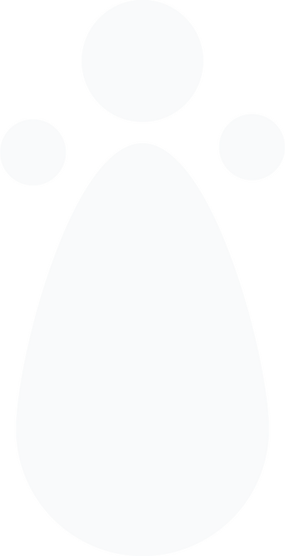
WORDMARK

The rounded letter forms and addition of accenting circles serve the purpose of expressing individuality. This individuality separates the word mark from any other Northstar text. The roundedness also creates a deeper relationship between text and icons maintaining continuous round forms. Lastly the added circles reference braille in a subtle way, as well as the spherical carvings known as “cups” found in ancient British rock art.
THE PEOPLE BEHIND NORTHSTAR
AARON MCINTOSH
DIRECTOR / DESIGNER
It all begins with empathy as I’ve learned as a budding designer. Learning about the struggles and lack of consideration for those with vision impairments and truly impairments of all types, expanded my scope and understanding of the role of a designer. We have the power to change lives for better or worse, and with Northstar I plan to better the lives of all people while also increasing awareness of our peers in life that are not allowed access to experiences in a way that
majority of us are.
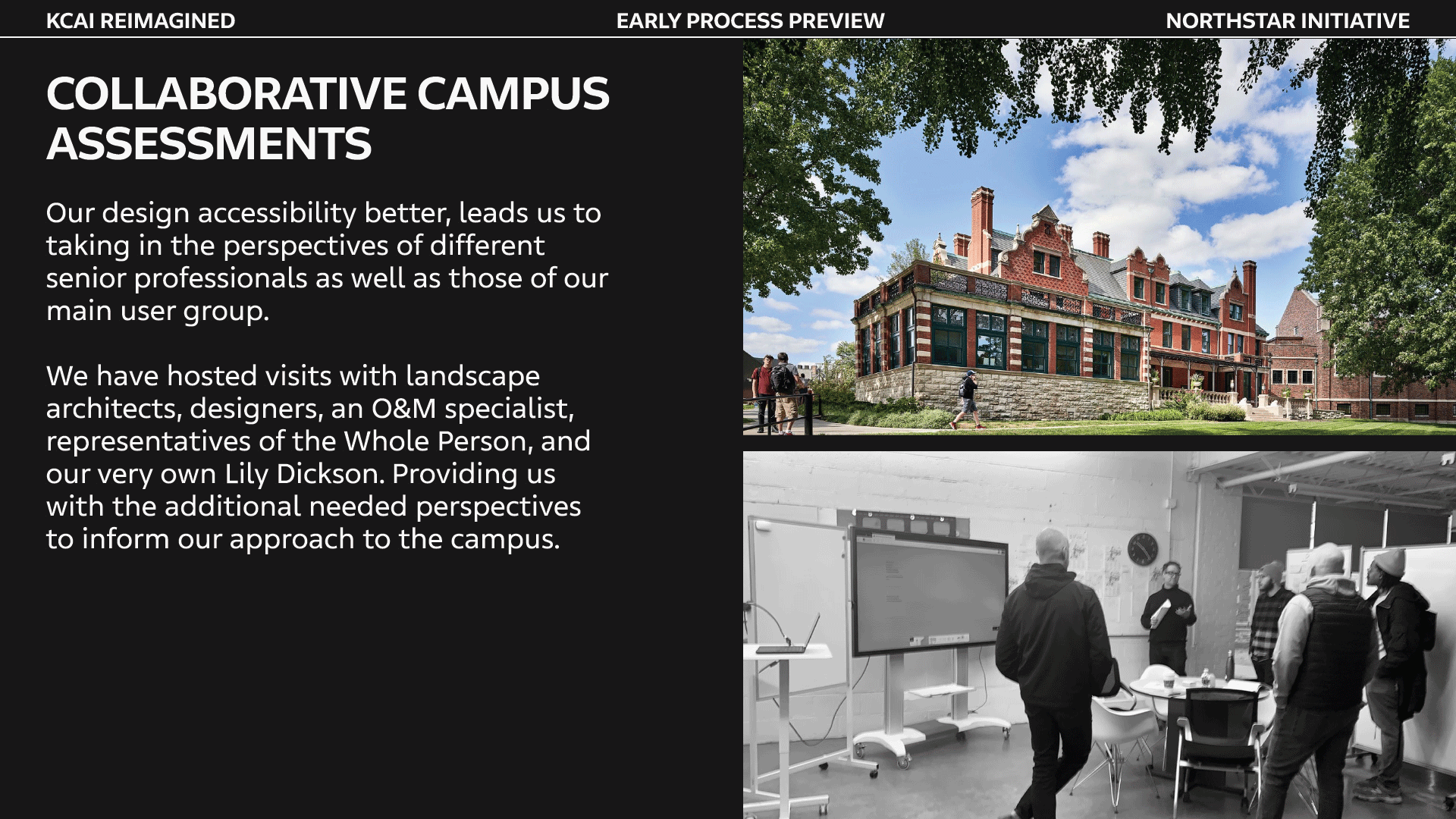
A CELEBRATION OF COLLABORATION
Collaboration in design is crucial, and for Northstar has been at the forefront since the beginning. Through building genuine relationships Northstar has received attention and support from both local and international designers.


In addition to the amazing people above, Northstar has also recieved the support of Tucker Trotter, CEO at Dimensional Innovations, David Dowell, Principal at El Dorado, and Sean Kelley, Head of Art Business Development at Zahner.
WORK IN PROGRESS
CONTACT US
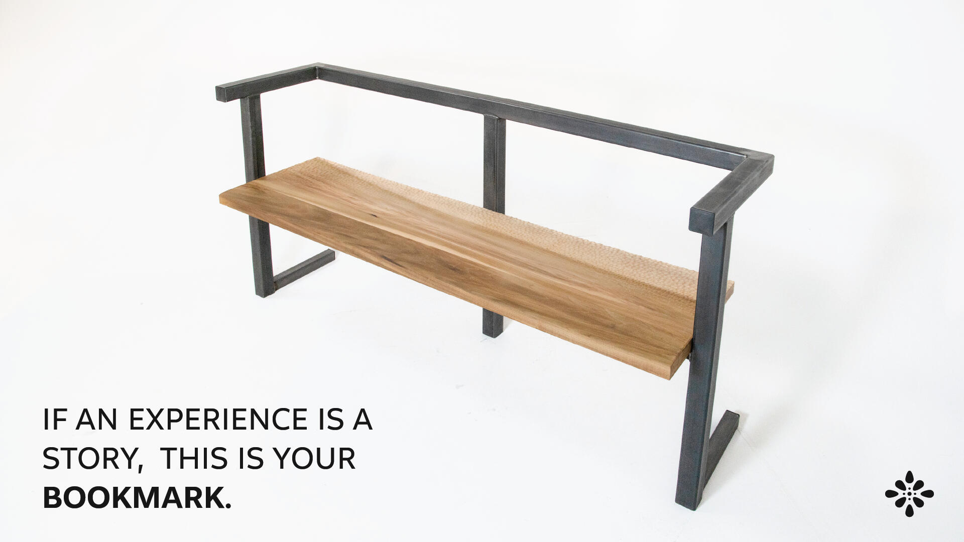
NAVIGATING BEYOND SIGHT: A NORTHSTAR WORKSHOP WITH AAGKC
Exploring multi-sensory design challenges through collaboration, creativity, and accessibility
Thursday, August 28TH 2025
REIMAGINING NAVIGATION
Accessible Arts Greater Kansas City (AAGKC) believes the arts should be a space where everyone belongs. With Northstar, we created a workshop that asked a simple but powerful question: How do we find our way when sight is not available? Through playful challenges and collective imagination, participants re-discovered navigation through texture, rhythm, and sound — challenging participants to consider deeply how we think about accessibility in everyday life.
WORKSHOP CONCEPT: "SENSING THE WAY"
In this interactive exercise, participants were invited to step into the world of non-visual navigation. Each group received a tactile challenge card describing a real-world wayfinding barrier, and were asked to reimagine how people might move, orient, and connect without relying on sight. With just thirty minutes, the task was not to solve every problem, but to experiment — to think differently about space, access, and possibility.
TRY IT YOURSELF!
Below are the same challenge cards we used during the workshop. Each one is a small window into the everyday barriers faced by many, and an invitation to imagine new solutions. As you read them, ask yourself: How might you approach this challenge? What sensory cues could help someone find their way?
VOICES IN CONVERSATION
This workshop was guided not only by Northstar, but also by guest speakers whose work embodies accessibility, artistry, and innovation. Their perspectives remind us that inclusive design is always a collaborative effort, rooted in lived experience and creative vision. Together, their voices shape a richer understanding of how we can navigate the world with empathy and imagination.
LILY DICKSON
MULTI-MEDIA ARTISTI am interested in creating structures of discomfort, unease, and confusion. As a legally blind multimedia artist, I investigate the relationship between layered 2D and 3D landscapes. I combine my interest in perspectival experiences within paintings - spaces that confuse, obscure, and reveal the positions of the viewer - as it alludes to the visual dependency, discomfort, and disorientation I commune with every day. Motivated to make work that creates empathetic experiences. I don’t want people to “see” like me. I want the viewer to engage with sensory challenges that deny their normalized access to the world’s Information. My work challenges definitions of normalcy as it relates to sensory perception/ reception. Through formal and experimental abstraction, I find navigational agency in my work that is relatively scarce elsewher
LYDIA MORENO
STEM EDUCATOR | ARTISTLydia Moreno is a creative problem solver, with nine years of experience in design, audio/visual production, and fabrication. Inspired by her work with the Mural Arts Program in Philadelphia, she has a passion for social design & public art that brings people together and tells the unique stories of her hometown in Kansas City, Kansas. Lydia currently works as the Makerspace Coordinator at the Kansas State School for the Blind, where she empowers visually impaired students to innovate using modern tech like 3D printers and laser cutters. Her work centers on the question, "is it accessible?", ensuring that every creative solution is inclusive and groundbreaking.

KEITH KIRKLAND
HAPTICS DESIGNER | HAPTICNAV CO-FOUNDERKeith Kirkland is a mechanical engineer, accessories designer, and industrial designer turned haptics enthusiast, professor and futurist. He is deeply excited about reimagining the use of the sense of touch (haptics) in movement learning, education, and product design. He is serial entrepreneur inspired by the accessibility of touch, equitable business models and wearable tech.His work in haptics has been recognized by the Pratt’s Rowena Reed Award, SXSW, The Smithsonian, TED, Dropbox, Google, Verizon, The Yokohama Government, Perkins School for the Blind, Unilever, Bauhaus, The Cerebral Palsy Alliance Research Foundation, EY, and the MET Museum. He is currently founder + CEO of The Haptic 9 Co, a startup focused on haptics and movement learning.
DESIGN BEYOND SIGHT PRESENTATION
This deck shares the story of Northstar’s origins, celebrates collaboration in the accessible design field, and highlights the voices of colleagues who have shaped our path. It offers a glimpse into how accessibility, artistry, and community continue to guide the work of Northstar and its partners.
IN CLOSING
Accessibility is not a finished project — it’s a shared journey. We hope this workshop inspires you to notice the ways environments shape experience, and to imagine creative, multi-sensory solutions in your own work and community.
WHERE ACCESS MEETS IMAGINATION, AND THE WAY FORWARD IS TOGETHER.

MISSION
The Northstar Initiative is a project centered around equitable accessibility to cultural institutions of human expression. With an emphasis on expressive and functional solutions for the betterment of the visually impaired experience.
VISION
Our vision is to increase awareness of the array of perspectives and experiences of visually impaired people, as well as to encourage more holistic & inclusive design thinking.
STORYTELLING
"Northstar" alludes to Polaris, a constant celestial body that has been used throughout time to aid in humanity's exploration of the unknown. Northstar branding takes inspiration from the history of human need. Design has become far more complex, making the solutions to our needs exclusive. Northstar strives to return to the simplicity of our ancestors, to meet the needs of the now, as need does not discriminate like any impairment but crosses all lines and barriers, connecting us to one another since the beginning of human history.
FOCAL POINTS
SUSTAINABLE - Being considerate and responsible does not short change the capabilities of design. Through continued innovation and care, our work can remain sustainable.
ACCESSIBLE - As designers seeking to improve lives, create positive impact, and help people. We must value, implement, and understand what it means to be accessible.
THOUGHTFUL - People matter. It is through continued collaboration with clients and the communites we look to serve that our work remains thoughtful.
LOGOS
The simplicity of stone age problem solving has inspired our approach to simple but effective problem solving. Replicating simple functionality, the Northstar logo acts as the central tool in which all icons and symbols are built from. There is a megalithic element to Northstars branding as well, pulling from stone formations like Stonehenge or Carnac. The purpose of this being to reference the influence of the celestial body Polaris, as well as give the branding additional space to flex and morph to fit contextual need.
COREMARK
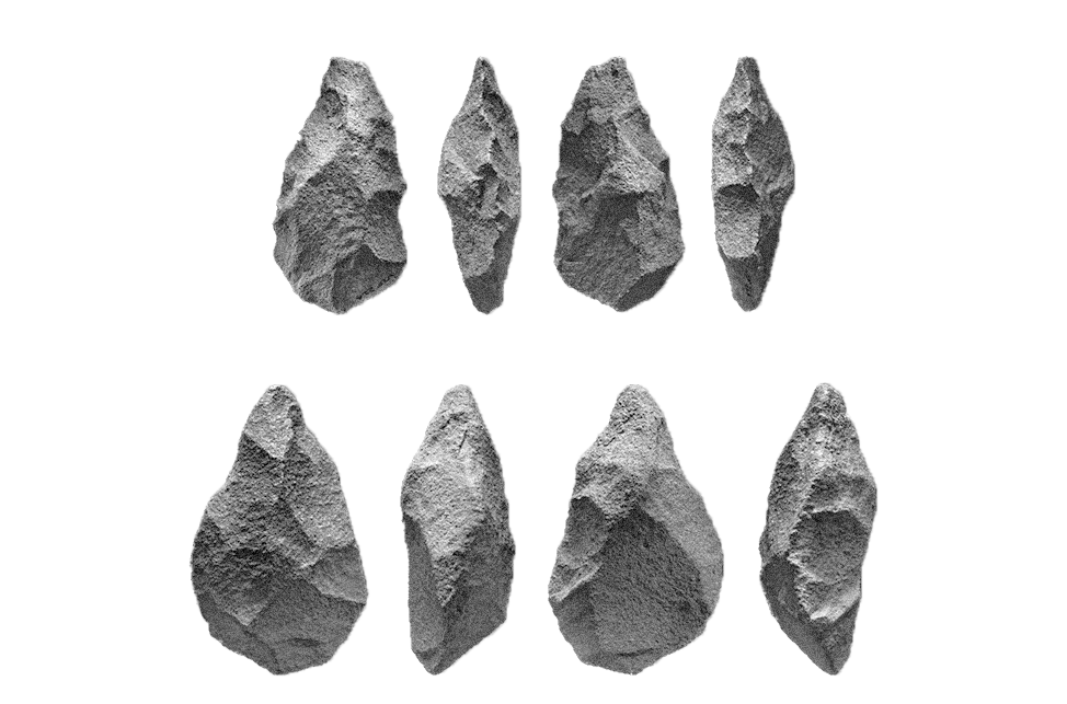
These simple hand tools have been a recording of human history, retelling our evolution as problem solvers and critical thinkers. The oldest stone tools are dated to as far back as 2.6 million years, and through continued evolution, still see use today. These objects were crafted all over the world, meeting the needs of early humans, and remaining reliable throughout human history.

SEEING STONE
Inspired by the form of neolithic tools like hammerstones and hand axes. Receiving its name from the concept of accessing the world around us through an inconspicuous tool.


RETICLE
Communicating focus, and guided exploration. The reticle is a calling to those found in optical devices like telescopes.
WORDMARK

Thought to have been created by the process of “pecking” – which involved gradually chipping away the surface of stone with a chisel – these carvings are found along the Atlantic seaboard of Europe. The image shown displays markings known as “cups” (spherical indentations), and “rings” (shallow carved lines). Showing distinct regional variation, these markings help us in understanding how communities of the past remained connected and communicated with one another.

The rounded letter forms and addition of accenting circles serve the purpose of expressing individuality. This individuality separates the word mark from any other Northstar text. The roundedness also creates a deeper relationship between text and icons maintaining continuous round forms. Lastly the added circles reference braille in a subtle way, as well as the spherical carvings known as “cups” found in ancient British rock art.
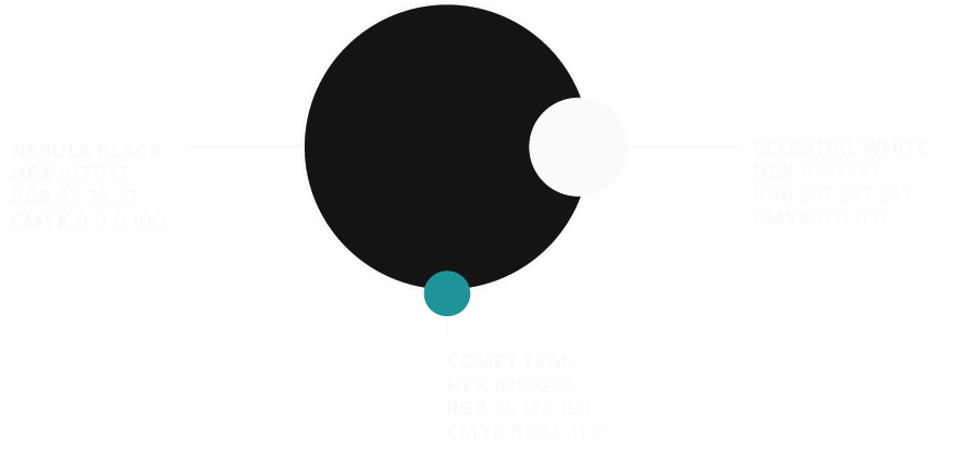
COLOR PALETTE
Black and white are high contrasting colors which makes them the easiest for those with visual impairment to decipher. This increased level of access to the visual as well as the simplicity and flexibility of these two colors is why they were the choice for Northstar. The addition of a tertiary was found to be necessary as a highlighting element specifically in the case of data visualization. Teal was chosen over other attention grabbing colors like red, due to its harmonious nature. It is attention grabbing while avoiding the perceived aggressiveness of other red. Lastly it is a safe pairing with black and/or white as an accessible color combination.
TYPOGRAPHY
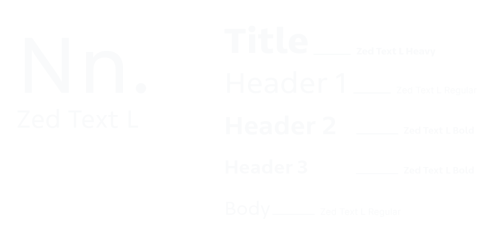
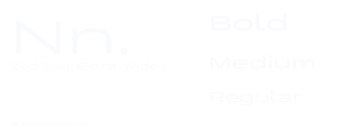
Designed by Dutch type foundry Typotheque. Zed embodies many aspects of what Northstar aspires to be from a design point of view. It is beautiful, functional, innovative, and has a deep history of research and collaboration to validate its final form.
ICON LIBRARY

HUMAN

GATHERING
ARROW

SOUND

SIGHT

TOUCH

SCENT

DESTINATION

GREENERY


Every icon within our library pulls reference from our core influences, those being early human making, and natural form. All of our icons pull form from our core mark, the goal being to maintain simplicity and strengthen the association these forms with the brand that is Northstar. Our Icon library is forever expanding as new projects and problems present new opportunities.