Inspired by the visually impaired perspective, we design multi-sensory experiences meant to empower all people.


“Collaboration is the foundation of inclusion. At Northstar, every project is a conversation — one that ends in something all can experience.”
— Aaron McIntosh, Director of Northstar Initiative
Northstar is a multisensory design studio devoted to building a more inclusive world — one that speaks to the hands, ears, and intuition as much as the eyes. We work at the intersection of accessibility innovation, tactile wayfinding, and environmental storytelling, with a special focus on serving blind and visually impaired communities.Rooted in shared human tools — stone markers, petroglyphs, directional textures — our work is guided by simplicity, continuity, and a deep respect for collaboration. Whether developing public installations or research-driven artifacts, every project begins with people and ends with a place made more open.

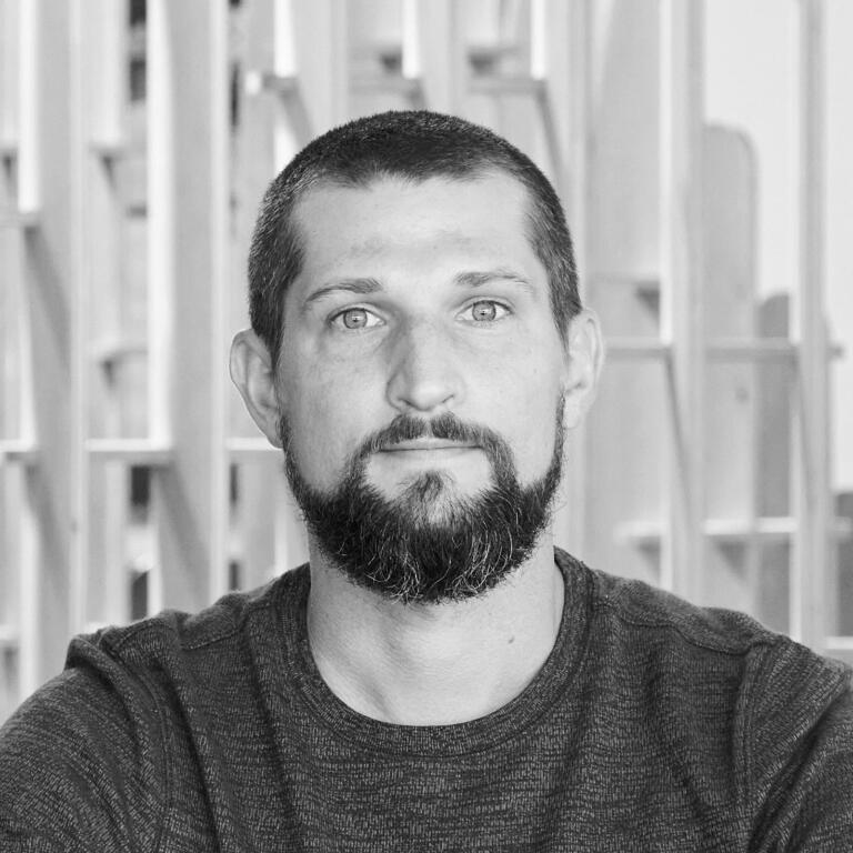
DIRECTOR | DESIGNER
Aaron McIntosh

VI ARTIST | HEAD ADVISOR
Lily Dickson

O+M SPECIALIST | HEAD ADVISOR
Sean Verbanic
A CELEBRATION OF COLLABORATION
Collaboration sits at the core of Northstar. The work is shaped through ongoing exchange with designers near and far—each voice contributing to a shared language of access, place, and possibility. What follows is a recognition of those who have helped carry the work forward.

Edwing Mendez Director at Nada Creative

Josh Ogren Computational Designer at TFC
Cale Doornbos Landscape Architect at LJC

Kekeli Dawes Architectural Designer

Keith Kirkland Founder of Haptic Nav

Emily Yates Head of Accessible Design at MIMA

Elvis Achelpohl Associate Architect BNIM

Matthew Scheupach Senior Project Manager


Edwing Mendez | Director at Nada Creative
Josh Ogren | Computational Designer at TFC

Cale Doornbos | Landscape Architect at LJC

Kekeli Dawes | Architectural Designer

Keith Kirkland | Founder of Haptic Nav

Emily Yates | Head of Accessible Design at MIMA

Elvis Achelpohl | Associate Architect BNIM

Matthew Scheupach | Senior Project Manager


NEWS

MAY 2026
BOOKMARK BENCH DONATED TO KSSB
A project returning to the community that helped shape it.

AUGUST 2025
DESIGN BEYOND SIGHT: AAGKC WORKSHOP
Exploring accessibility, perception, and design through multisensory experience.

MAY 2025
THE WHOLE PODCAST: DESIGNING THE FUTURE OF ACCESSIBILITY
Reflecting on the origins of Northstar and the future of accessible design.
BRAND ETHOS
MISSION
The Northstar Initiative is a design studio dedicated to advancing equitable accessibility within cultural institutions and public spaces. We specialize in
expressive, functional solutions that improve the spatial and sensory experiences of the visually impaired — while enriching environments for all.
VISION
To expand awareness of diverse human experiences, creating space for all people — regardless of impairment or restriction — to be seen, heard, and considered. We champion holistic, inclusive design thinking as a foundation for better, more humane environments.
STORYTELLING
Northstar takes its name from Polaris, a constant guide through unfamiliar terrain. Our work is rooted in the earliest human practice: inventing in response to need. In those early gestures — simple tools shaped for survival and shared use — design was universal. It crossed barriers of language, ability, and status. Northstar carries this ethos forward, crafting multisensory, inclusive environments shaped by necessity, refined by simplicity, and built for all.
FOCAL POINTS
THOUGHTFUL - People matter. It is through continued collaboration with clients and the communites we look to serve that our work remains thoughtful.
SUSTAINABLE - Being considerate and responsible does not short change the capabilities of design. Through continued innovation and care, our work can remain sustainable.
ACCESSIBLE - As designers seeking to improve lives, create positive impact, and help people. We must value, implement, and understand what it means to be accessible.
LOGOS
Northstar takes its name from Polaris, a constant guide through unfamiliar terrain. Our work is rooted in the earliest human practice: inventing in response to need. In those early gestures — simple tools shaped for survival and shared use — design was universal. It crossed barriers of language, ability, and status. Northstar carries this ethos forward, crafting multisensory, inclusive environments shaped by necessity,
refined by simplicity, and built for all.
COREMARK
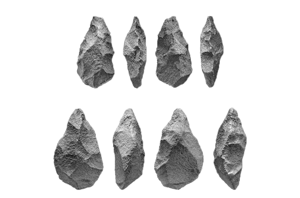
These simple hand tools have been a recording of human history, retelling our evolution as problem solvers and critical thinkers. The oldest stone tools are dated to as far back as 2.6 million years, and through continued evolution, still see use today. These objects were crafted all over the world, meeting the needs of early humans, and remaining reliable throughout human history.

SEEING STONE
Inspired by the form of neolithic tools like hammerstones and hand axes. Receiving its name from the concept of accessing the world around us through an inconspicuous tool.

RETICLE
Inspired by the form of neolithic tools like hammerstones and hand axes. Receiving its name from the concept of accessing the world around us through an inconspicuous tool.
WORDMARK
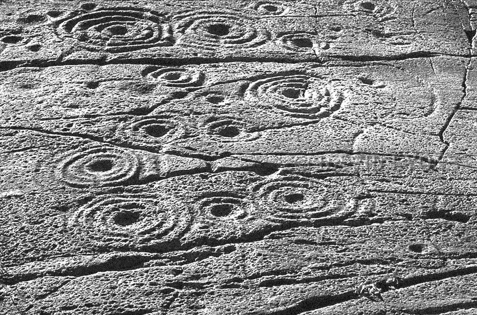
Thought to have been created by the process of “pecking” – which involved gradually chipping away the surface of stone with a chisel – these carvings are found along the Atlantic seaboard of Europe. The image shown displays markings known as “cups” (spherical indentations), and “rings” (shallow carved lines). Showing distinct regional variation, these markings help us in understanding how communities of the past remained connected and communicated with one another.

The rounded letter forms and addition of accenting circles serve the purpose of expressing individuality. This individuality separates the word mark from any other Northstar text. The roundedness also creates a deeper relationship between text and icons maintaining continuous round forms. Lastly the added circles reference braille in a subtle way, as well as the spherical carvings known as “cups” found in ancient British rock art.
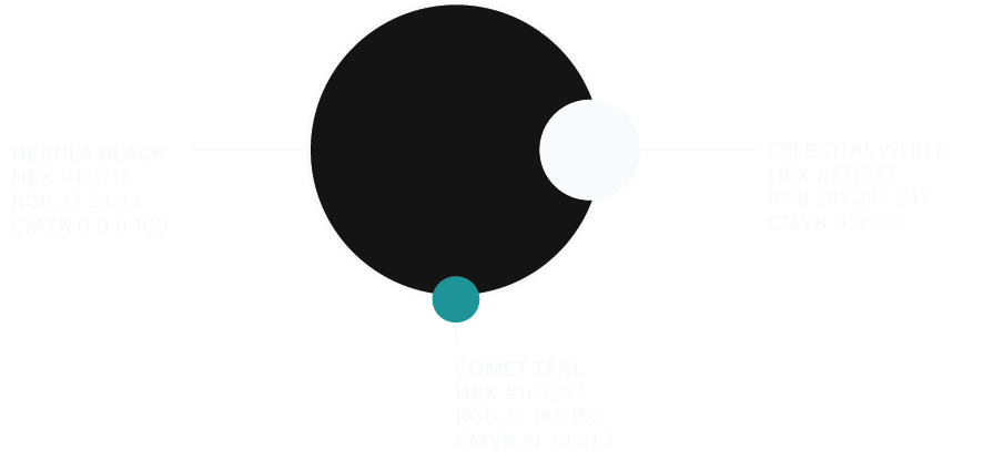
COLOR PALETTE
Black and white are high contrasting colors which makes them the easiest for those with visual impairment to decipher. This increased level of access to the visual as well as the simplicity and flexibility of these two colors is why they were the choice for Northstar. The addition of a tertiary was found to be necessary as a highlighting element specifically in the case of data visualization. Teal was chosen over other attention grabbing colors like red, due to its harmonious nature. It is attention grabbing while avoiding the perceived aggressiveness of other red. Lastly it is a safe pairing with black and/or white as an accessible color combination.
TYPOGRAPHY
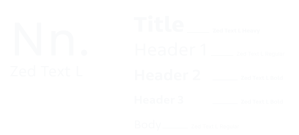
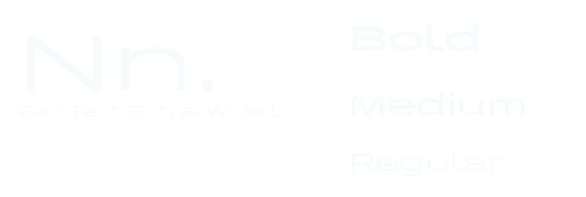
Designed by Dutch type foundry Typotheque. Zed embodies many aspects of what Northstar aspires to be from a design point of view. It is beautiful, functional, innovative, and has a deep history of research and collaboration to validate its final form.
ICON LIBRARY

HUMAN

GATHERING

ARROW

SOUND

SIGHT

TOUCH

SCENT

DESTINATION


Every icon within our library pulls reference from our core influences, those being early human making, and natural form. All of our icons pull form from our core mark, the goal being to maintain simplicity and strengthen the association these forms with the brand that is Northstar. Our Icon library is forever expanding as new projects and problems present new opportunities.


DIRECTOR | DESIGNER
Aaron McIntosh
My work begins with empathy—through listening, observing, and recognizing the gaps left by systems not built for everyone. In learning from communities too often overlooked, particularly those who are blind or visually impaired, I’ve come to understand design as a responsibility as much as a practice. Through Northstar, that awareness becomes action: creating environments that invite broader participation, while bringing greater visibility to those too often left out of the picture.
ENGAGEMENTS

KCAI End Of Semester Interview
Winter 2024
In conversation at KCAI’s End of Semester Show, this interview focused on the development of directional textures as both a product and a multisensory navigation tool. The discussion traced how wayfinding systems can extend beyond the visual—supporting orientation, access, and a broader understanding of how we move through shared environments.

The Whole Person Podcast
Spring 2025
In this episode with The Whole Person, the conversation reflects on a personal path into design and the formation of Northstar. From early experiences to current work, the dialogue explores directional textures within KCAI projects, alongside future-facing ideas for wayfinding—considering how multisensory systems might continue to evolve toward more open and inclusive environments.


MAY 2026
BOOKMARK BENCH DONATED TO KSSB
A full-circle moment for one of Northstar’s earliest explorations.
This week, the original Directional Texture Bench was donated to the Kansas State School for the Blind, where it will remain as a permanent installation on campus. The bench represents an early exploration into tactile navigation and multisensory communication—work that is foundational to Northstar’s broader design philosophy.Years earlier, the initial concepts surrounding directional textures were tested and developed alongside students and faculty at KSSB through feedback, conversation, and shared exploration. Returning the bench to the school marks a meaningful full circle moment, placing the work back within the community that helped validate and shape its existence from the beginning.As both a functional object and a record of research, the bench now remains within the environment that first gave the project purpose.


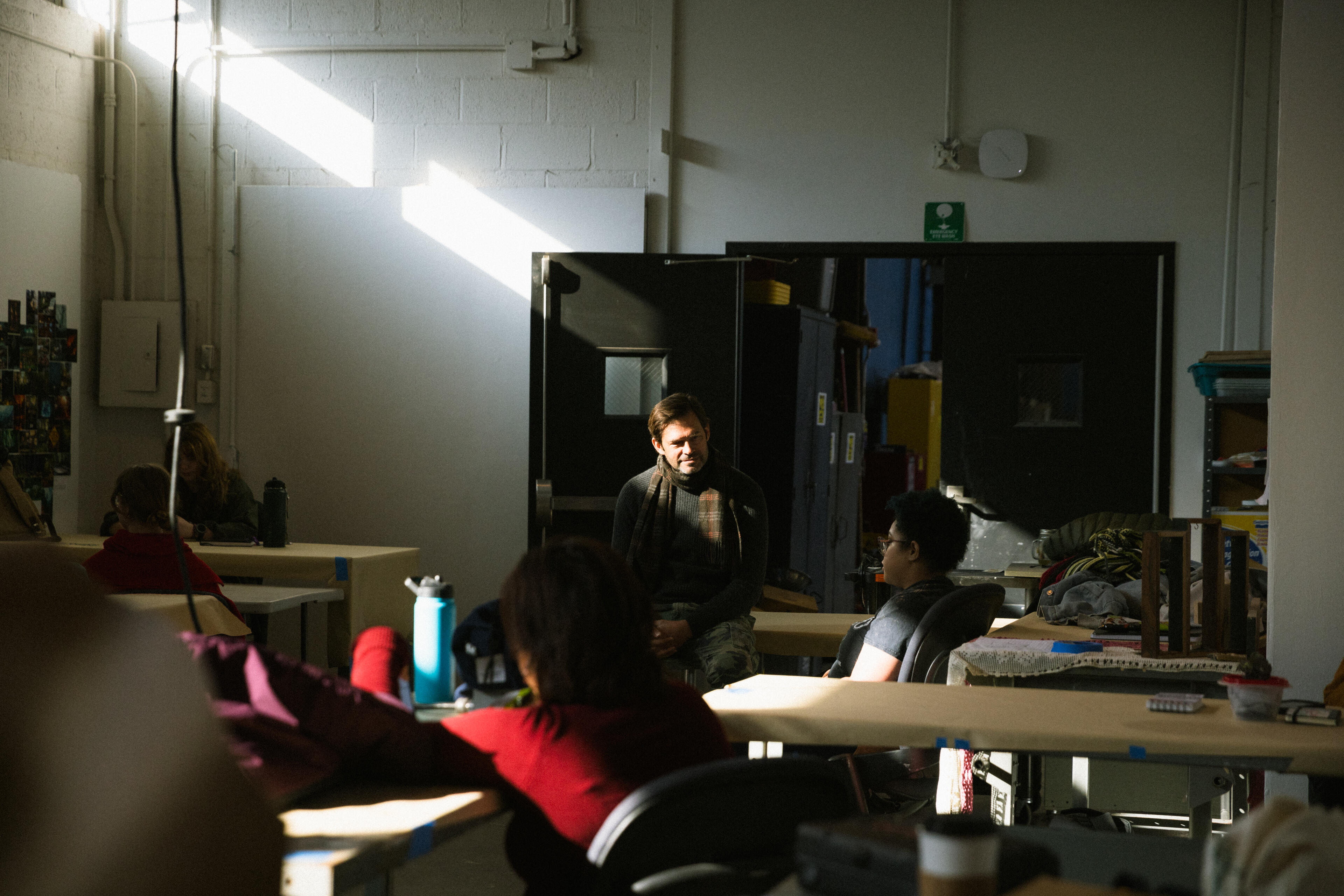
NAVIGATING BEYOND SIGHT: A NORTHSTAR WORKSHOP WITH AAGKC
Exploring multi-sensory design challenges through collaboration, creativity, and accessibility
Thursday, August 28TH 2025
REIMAGINING NAVIGATION
Accessible Arts Greater Kansas City (AAGKC) believes the arts should be a space where everyone belongs. With Northstar, we created a workshop that asked a simple but powerful question: How do we find our way when sight is not available? Through playful challenges and collective imagination, participants re-discovered navigation through texture, rhythm, and sound — challenging participants to consider deeply how we think about accessibility in everyday life.
WORKSHOP CONCEPT: "SENSING THE WAY"
In this interactive exercise, participants were invited to step into the world of non-visual navigation. Each group received a tactile challenge card describing a real-world wayfinding barrier, and were asked to reimagine how people might move, orient, and connect without relying on sight. With just thirty minutes, the task was not to solve every problem, but to experiment — to think differently about space, access, and possibility.
TRY IT YOURSELF!
Below are the same challenge cards we used during the workshop. Each one is a small window into the everyday barriers faced by many, and an invitation to imagine new solutions. As you read them, ask yourself: How might you approach this challenge? What sensory cues could help someone find their way?
VOICES IN CONVERSATION
This workshop was guided not only by Northstar, but also by guest speakers whose work embodies accessibility, artistry, and innovation. Their perspectives remind us that inclusive design is always a collaborative effort, rooted in lived experience and creative vision. Together, their voices shape a richer understanding of how we can navigate the world with empathy and imagination.

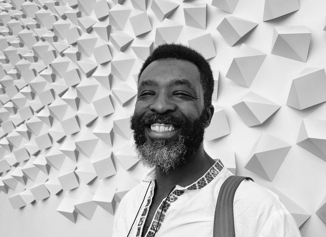
LILY DICKSON
MULTI-MEDIA ARTISTI am interested in creating structures of discomfort, unease, and confusion. As a legally blind multimedia artist, I investigate the relationship between layered 2D and 3D landscapes. I combine my interest in perspectival experiences within paintings - spaces that confuse, obscure, and reveal the positions of the viewer - as it alludes to the visual dependency, discomfort, and disorientation I commune with every day. Motivated to make work that creates empathetic experiences. I don’t want people to “see” like me. I want the viewer to engage with sensory challenges that deny their normalized access to the world’s Information. My work challenges definitions of normalcy as it relates to sensory perception/ reception. Through formal and experimental abstraction, I find navigational agency in my work that is relatively scarce elsewher

LYDIA MORENO
STEM EDUCATOR | ARTISTLydia Moreno is a creative problem solver, with nine years of experience in design, audio/visual production, and fabrication. Inspired by her work with the Mural Arts Program in Philadelphia, she has a passion for social design & public art that brings people together and tells the unique stories of her hometown in Kansas City, Kansas. Lydia currently works as the Makerspace Coordinator at the Kansas State School for the Blind, where she empowers visually impaired students to innovate using modern tech like 3D printers and laser cutters. Her work centers on the question, "is it accessible?", ensuring that every creative solution is inclusive and groundbreaking.
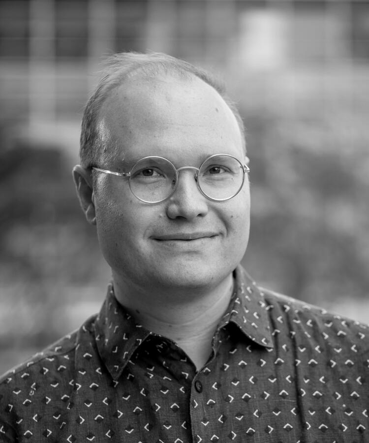
KEITH KIRKLAND
HAPTICS DESIGNER | HAPTICNAV CO-FOUNDERKeith Kirkland is a mechanical engineer, accessories designer, and industrial designer turned haptics enthusiast, professor and futurist. He is deeply excited about reimagining the use of the sense of touch (haptics) in movement learning, education, and product design. He is serial entrepreneur inspired by the accessibility of touch, equitable business models and wearable tech.His work in haptics has been recognized by the Pratt’s Rowena Reed Award, SXSW, The Smithsonian, TED, Dropbox, Google, Verizon, The Yokohama Government, Perkins School for the Blind, Unilever, Bauhaus, The Cerebral Palsy Alliance Research Foundation, EY, and the MET Museum. He is currently founder + CEO of The Haptic 9 Co, a startup focused on haptics and movement learning.
DESIGN BEYOND SIGHT PRESENTATION
This deck shares the story of Northstar’s origins, celebrates collaboration in the accessible design field, and highlights the voices of colleagues who have shaped our path. It offers a glimpse into how accessibility, artistry, and community continue to guide the work of Northstar and its partners.
IN CLOSING
Accessibility is not a finished project — it’s a shared journey. We hope this workshop inspires you to notice the ways environments shape experience, and to imagine creative, multi-sensory solutions in your own work and community.
WHERE ACCESS MEETS IMAGINATION, AND THE WAY FORWARD IS TOGETHER.


The Whole Person Podcast
In this two-part conversation with The Whole Person, Northstar Initiative Founder, Aaron McIntosh reflects on his journey into accessible and multisensory design, the origins of Northstar, and the experiences that shaped his approach to environmental communication and wayfinding.The discussion explores the development of directional textures, ongoing work with the Kansas City Art Institute, and broader conversations surrounding accessibility, perception, and the future of inclusive design. Moving between personal history and speculative thinking, the podcast offers insight into the values, research, and collaborative spirit that continue to guide Northstar’s work.


MULTI-MEDIA ARTIST | FOUNDING COLLABORATOR
Lily Dickson
Lily's work explores structures of discomfort, unease, and disorientation. As a legally blind multimedia artist, she investigates the relationship between layered two and three-dimensional spaces — creating environments that obscure, reveal, and shift the viewer’s sense of position.Drawing from lived experience, their practice challenges visual dependency and the assumption of normalized access to the world’s information. Rather than asking others to “see” as they do, the work invites engagement through sensory disruption — opening space for empathy, reflection, and new forms of perception. Through abstraction and experimentation, she seeks to reclaim a sense of navigational agency within environments where it is often limited.


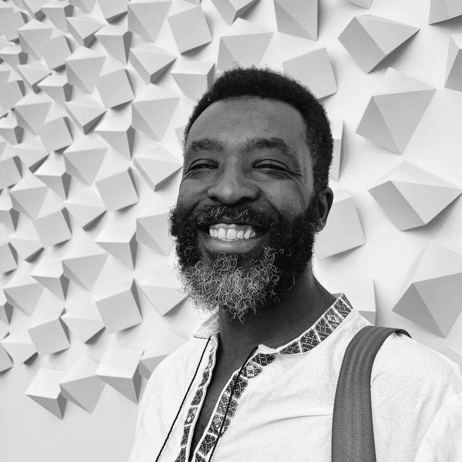
O+M SPECIALIST | HEAD ADVISOR
Sean Verbanic
With eight years of experience as an Orientation and Mobility Specialist, my work is grounded in supporting individuals who are blind or visually impaired in navigating the world with greater confidence and independence. This practice extends into my work with Integrative Vision Solutions, reflecting a broader commitment to the business and delivery of accessibility services. Through mobility training and adaptive strategies, I aim to expand access, strengthen spatial awareness, and support more open ways of moving through the environment.


NORTHSTAR INITIATIVE
A Public Space Navigation Tool

Kansas City Art Institute
Art for All

Mission Kansas Parks + Recreation
Converging Currents
The need for more inclusive design is not abstract — it is growing, measurable, and often misunderstood. As the population of individuals with visual impairments continues to rise, so too does the urgency for environments that support a wider range of ways of moving, sensing, and understanding space.Yet common assumptions persist. Visibility is often mistaken for understanding, and solutions are frequently shaped by perception rather than lived experience. The reality is more nuanced: not all individuals who are visually impaired navigate with a cane, and not all needs are immediately apparent. When design relies on narrow expectations, it risks producing outcomes that are performative rather than genuinely supportive.Northstar’s work responds to this gap — grounded in listening, collaboration, and multisensory thinking. When design begins from assumption, it narrows. When it begins from listening, it remains open. Through this approach, we aim to move beyond surface-level accessibility toward systems that are adaptable, intuitive, and inclusive not only of the visually impaired community, but of the broader public as well.

People who are blind or visually impaired are three times more likely to experience loneliness and isolation. In part due to fear and anxiety for navigating new spaces.
THENLM.GOV
Inspired by the challenge of increasing park accessibility. Northstar collaborated with O&M specialists, designers, architects, and the Kansas State School for the blind to explore the concept of tactile navigation.This concept has since expanded into what we have coined
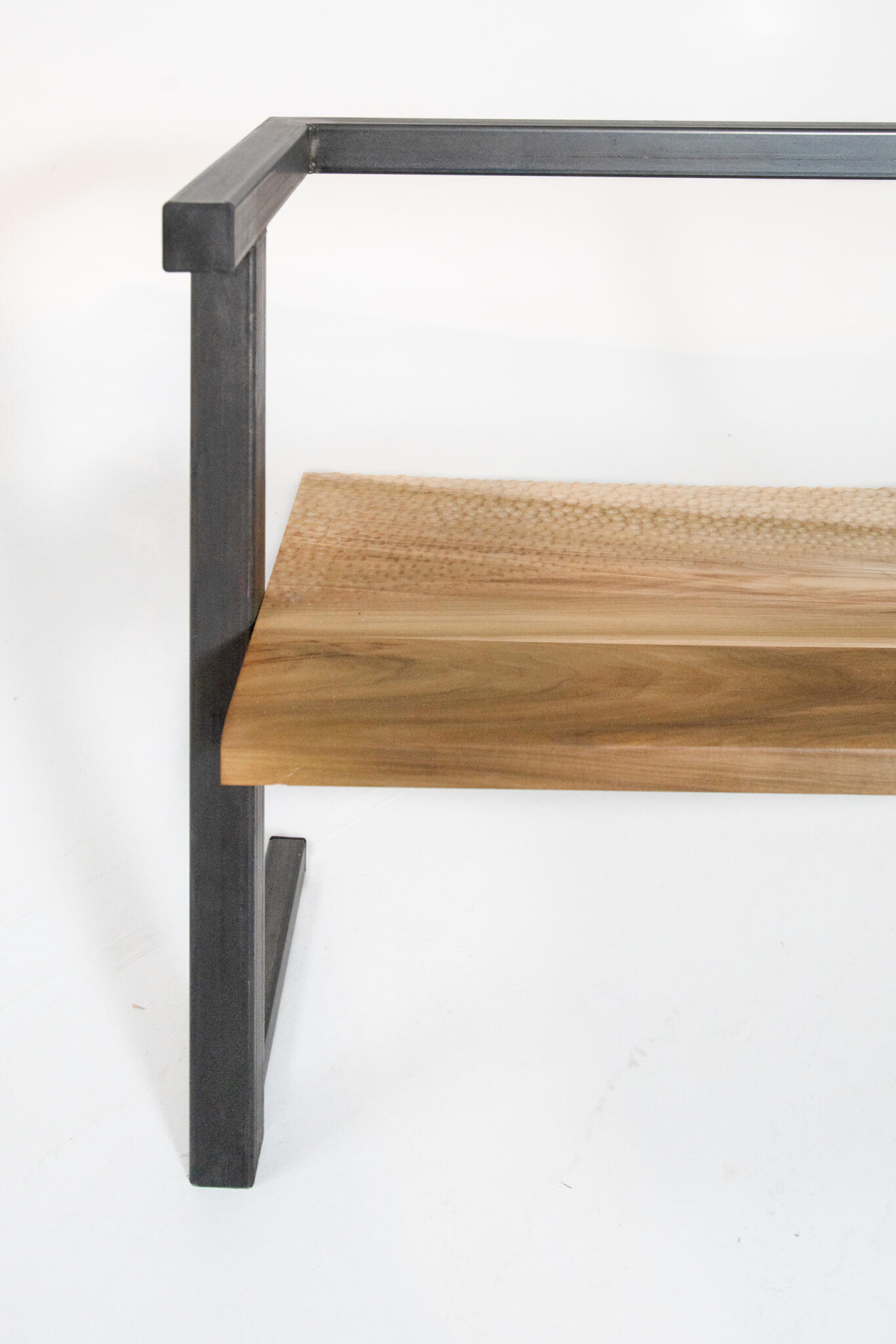
"Directional Textures", communicating directionality through touch.
TYPOLOGIES
Wayfinding | Product Design | FurnitureSTATUS
ActiveLOCATION
Kansas City, MOTEAM
Aaron McIntosh | Lead DesignerJosh Ogren | Computational Designer | HufftBrandon Sharp | Metal Fabricator | HufftJen Iseman | Photographer
Inspired by the traditional Japanese woodcarving technique "naguri", the bench’s tactile surface invites users to engage with its subtle yet purposeful texture. The texture evolves as you move along the bench — increasing in depth and scale toward the south end. This intentional gradient serves as a consistent visual and tactile cue of cardinal direction, providing a reliable reminder of orientation.
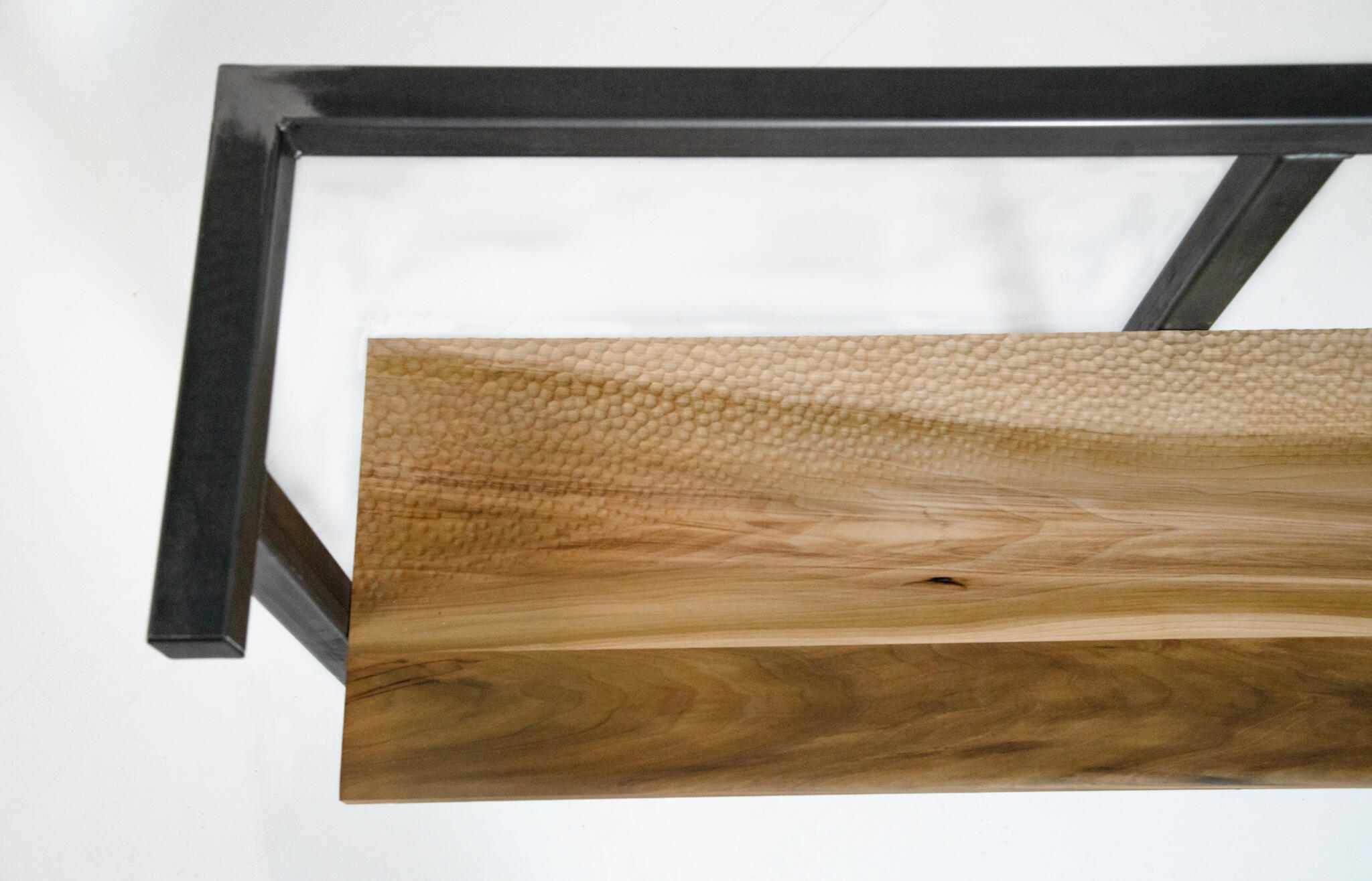
The Bookmark Bench offers more than seating; it creates an intuitive, sensory experience that enhances spatial awareness and orientation for all users.
By blending cultural craftsmanship with thoughtful design, the Bookmark Bench transforms everyday interaction into an accessible journey of discovery and direction.

“The way to the goal is more important than the goal itself.”
— Otl Aicher
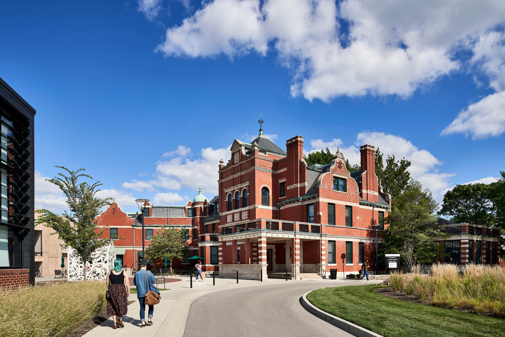
Prompted by the challenge of making a historic visual arts campus more intuitive and inclusive, Northstar designed a holistic wayfinding system for the Kansas City Art Institute—connecting interior and exterior spaces through tactility and multisensory design.This work culminated in a campus-wide strategy and the creation of a tactile guidelines book: a tool designed not just to inform, but to embody the sensory principles it promotes.
TYPOLOGIES
Wayfinding | Signage Design |
Computational DesignSTATUS
ActiveLOCATION
Kansas City, MOTEAM
Aaron McIntosh | Lead Designer + Project ManagerPaul Martin | The Fabrication Company
INTERIOR SYSTEMS
The interior systems are shaped by the conditions of the spaces they serve. Across studios and administrative environments, a shared language of form, texture, and hierarchy supports orientation while adapting to different patterns of use. From open, exploratory spaces to more structured settings, the system remains consistent in
intent—providing clarity, access, and a more intuitive understanding of place.

STUDIO SPACES
Composed of three core elements: the building directory, the room ID totems, and the sensory feature wall. Each designed with a unique role—introducing, guiding, and enriching the user’s journey through space. The creative spark, constant collaboration and exploration inspired this system to be one as lively as the space it is inhabiting and the people it serves.What ties them together is a consistent use of tactile communication. Through form, texture, and material, each piece supports a navigation experience that invites both exploration and confidence — where wayfinding becomes not just about getting somewhere, but feeling welcomed along the way.
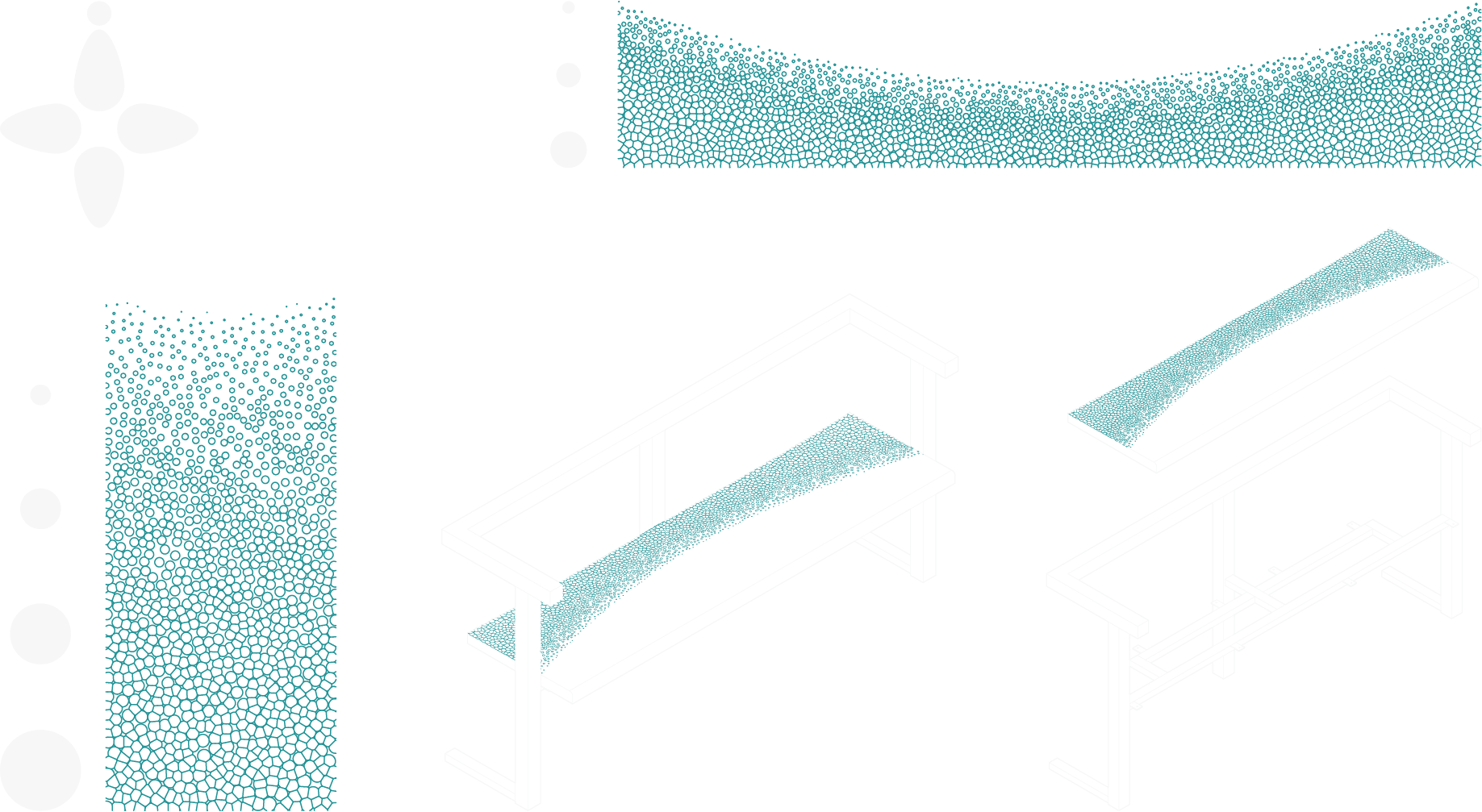
DIRECTIONAL TEXTURE INTEGRATION
A tactile and visual system layered with meaning — guiding movement, communicating space, and extending the college’s identity. Inspired by the Hermann Grid, the surface uses sequences of concave and convex forms that shift in scale, creating directional cues that become more legible as users approach key points of interaction.Subtle shifts in scale, pattern, and line weight reinforce movement, while the use of concave and convex forms establishes a secondary code — distinguishing departments and spatial zones through touch, alongside color and typographic cues.

Hermann Grid

Room ID Totems

Sensory Feature Wall Panel


BUILDING DIRECTORY
The building directory serves as a first point of orientation — a physical and sensory anchor that provides clarity before movement begins. Through color-coded levels and tactile identifiers, it communicates the structure of the space, allowing users to quickly understand layout, department locations, and directionality within a complex environment.Thoughtful
Strategically placed at transitional zones such as entrances and lobbies, the directory invites a moment of grounding. It introduces and reinforces the spatial logic that carries throughout the system.Sustainable
Designed as a modular system, the directory can adapt over time. Updates to departments or layouts are accommodated through replaceable panels, extending the life of the piece without requiring full replacement.Accessible
Information is communicated through multiple sensory modes—tactile floorplans, raised lettering, braille, and color—creating an equitable point of entry for users of varying abilities.
ROOM ID TOTEMS
These totems provide close-range orientation at the thresholds of studios and offices — positioned where users naturally pause to confirm arrival. Each element extends the system’s shared language, using department-specific textures and bold color framing to create both tactile and visual recognition. Together, they reinforce navigation through consistency, building familiarity as users move through the space.Thoughtful
Designed to adapt to varied spatial conditions, the totems maintain consistency whether mounted flat or wrapping corners—aligning with how people naturally move, pause, and seek cues.Sustainable
Built as a modular system, components can be updated individually. Frame, text, and texture panels are replaceable, allowing the system to evolve without unnecessary waste.Accessible
Textural coding reflects department identity and is repeated across key touchpoints for continuity. Raised text, braille, and strong visual contrast support communication across multiple sensory modes, reducing reliance on any single form of perception.
SENSORY FEATURE WALL
This wall operates as both wayfinding system and experiential installation. As users move alongside it, shifts in texture density signal proximity to studios and offices, while transitions between department-specific patterns create a continuous tactile landscape. Rather than presenting information directly, the wall offers a tactile flow that can be read through touch — supporting both casual contact and intentional exploration. In doing so, it blurs the boundary between navigation and placemaking.Thoughtful
Integrated with the building’s architecture, the wall creates tactile continuity across corridors and transition points—guiding movement without interruption.Sustainable
Constructed as a durable, long-term feature, the system uses modular panels that allow for targeted updates and repair over time.Accessible
Through consistent, department-based textures and clear transitions, the wall provides intuitive non-visual cues. It invites touch without requiring instruction, supporting navigation in a more natural and inclusive way.
ADMINISTRATIVE SPACES
"SQUARED"
“Squared” is a modular signage system developed for KCAI’s administrative and resource buildings — an adaptation of the broader wayfinding language into a more structured and distilled form. Drawing from the material language of Vanderslice Hall and existing brand standards, it pairs acrylic panels with solid white oak to create a clear and consistent visual presence.Designed for flexibility, the system separates permanent elements — such as room numbers and braille — from updatable content, allowing information to evolve while maintaining continuity across the environment.Thoughtful
Designed for clarity and consistency, the system responds to the needs of more structured environments—prioritizing legibility, repetition, and ease of use across administrative spaces.Sustainable
Built as a modular system, “Squared” allows for targeted updates through replaceable components, reducing waste and extending the lifespan of each sign.Accessible
Core information is presented through multiple sensory modes, including raised text and braille. Clear hierarchy and high visual contrast support legibility, ensuring the system remains usable across a range of abilities.
EXTERIOR SYSTEMS
The exterior system extends the language of the interior into the broader campus environment. Across pathways, entry points, and gathering spaces, a shared vocabulary of form, texture, and hierarchy supports orientation at a larger scale—guiding movement between destinations while maintaining clarity and continuity. From moments of arrival to points of decision, the system remains consistent in intent: providing access, legibility, and a more connected understanding of place.

SYSTEM OVERVIEW
The exterior system introduces a set of shared navigation tools—carried across the campus through material, color, and touch. Directional textures emerge as an initial point of guidance, setting the tone for movement through shifts in surface and scale, while color-coded elements provide clarity at key moments of orientation. Together, these cues establish a consistent language that extends from the landscape into the interior.Information is anchored within a unified material expression, with brushed matte aluminum marking moments of guidance and interaction. Across overview totems, area kiosks, and interpretive signage, the system balances clarity with experience — supporting navigation while shaping a more connected and legible understanding of the campus.
OVERVIEW TOTEMS
Overview totems mark the threshold of the campus — positioned at its outer edges to signal arrival and departure. Rather than guiding movement within the campus, they provide a broader sense of context, situating KCAI within its surrounding environment.Through a restrained material palette of black and clear anodized aluminum, the totems present key landmarks — such as nearby museums and transit points — helping users understand their position in relation to the campus before moving further in. Directional textures are introduced subtly, offering an additional layer of orientation through touch.Thoughtful
Placed at the edges of the campus, the totems acknowledge moments of transition—offering users a clear understanding of where they are as they enter or exit the environment.Sustainable
Constructed from durable anodized aluminum, the system is designed for longevity with minimal maintenance, while allowing for targeted updates as surrounding conditions evolve.Accessible
Information is communicated through clear hierarchy and tactile integration, supporting both visual and non-visual navigation at a moment where users are first orienting themselves to place.

AREA KIOSKS
Area kiosks provide localized orientation within the campus — positioned at key intersections and gathering points where decisions are made. Building on the broader context established at the campus edge, they offer a more detailed understanding of pathways, destinations, and spatial relationships.Here, the system’s language becomes more pronounced. Color and texture coded mapping work together to guide movement, allowing users to read information visually or through touch. Anchored in brushed matte aluminum, each kiosk creates a consistent point of interaction—supporting navigation while reinforcing the continuity of the system.Thoughtful
Placed at each primary entry into the campus, the kiosks ensure that users encounter a point of orientation regardless of their path of arrival. A “you are here” marker anchors the user within the map, accounting for varied approaches and perspectives—particularly those arriving from street-level conditions.Sustainable
Designed as modular units, maps and information panels can be updated independently, allowing the system to adapt as the campus evolves.Accessible
Information is communicated through multiple sensory modes, including tactile maps, braille, and high-contrast color coding — supporting both visual and non-visual navigation in a clear and intuitive way.

ART INSTALLATION SIGNAGE
Art installation signage introduces an interpretive layer to the exterior system — supporting engagement with the campus’s cultural and creative landscape. Positioned alongside artworks and installations, these elements provide context without interrupting the experience, allowing users to encounter information at their own pace.Maintaining the system’s material and visual language, the signage integrates seamlessly into its surroundings while offering moments of pause and reflection. In contrast to more directive elements, it prioritizes storytelling and presence — extending wayfinding beyond navigation and into a deeper understanding of place.Thoughtful
Placed in direct relationship to artworks and installations, the signage supports moments of pause—offering context while respecting the integrity of the experience.Sustainable
Designed with modular components, content can be updated or replaced as exhibitions and installations evolve over time.Accessible
Information is communicated through clear hierarchy, tactile elements, and braille—ensuring that interpretive content is available across multiple modes of perception.

CLOSING REMARKS
KCAI Reimagined brings together a system of elements that extend beyond navigation—shaping how people move, orient, and connect within the campus. Across interior and exterior environments, a shared language of form, texture, and material creates continuity while adapting to different conditions of space and scale.Grounded in accessibility and informed by lived experience, the project reflects a broader approach to design—one that listens, responds, and remains open. In doing so, it moves beyond wayfinding as instruction, offering instead a more intuitive, inclusive, and connected experience of place.

“For it is through our feet, in contact with the ground, that we are most continually in touch with our surroundings.”
— Tim Ingold
Rock Creek Trail unfolds as a sequence of encounters shaped by ground, movement, and change. Along its path, subtle interventions emerge—planters, markers, and moments of rest—each responding to the conditions of the site while supporting orientation through touch, proximity, and spatial awareness. Rather than directing movement, these elements work in concert with the landscape, inviting users to navigate through shifting cues of material, planting, and form. What follows is a closer look at how each intervention engages the trail at the level of contact and experience.
TYPOLOGIES
Wayfinding | Signage Design |
Computational DesignSTATUS
ActiveLOCATION
Mission, KCDESIGNER
Aaron McIntosh | Lead Designer + Project Manager
MULTISENSORY THREAD
MULTISENSORY THREAD

Texture shifts gradually from west to east—softly carved to deeply defined— creating a directional cue that can be read through touch, movement, and light. Establishing a consistent, non-visual layer of navigation across the trail.
SYSTEM OVERVIEW
A system reimagining Rock Creek Trail as a continuous, multisensory experience — where navigation is embedded within the landscape itself. Through a combination of textured pathways, trail markers, and integrated planters, the system creates a cohesive language that guides movement while enriching the environment.A continuous textural line ties these elements together, offering orientation through touch, while plantings introduce seasonal shifts in scent and atmosphere. Rather than relying on isolated signage, the approach weaves direction, identity, and ecology into a unified experience — supporting a more intuitive and accessible way of moving through the trail.
PLANTER BOXES
Planters introduce moments of ecological expression along the trail, shaping space through native planting and seasonal change. Integrated with the directional texture system, they extend guidance beyond the ground plane—using edge, form, and material to reinforce movement and orientation. As both habitat and signal, they connect ecological rhythms with the experience of navigation.
ECOLOGY
Planting along the trail operates as both a placemaking and navigational system, using native species to support pollinators while engaging the senses. Fragrant and tactile plantings invite interaction, encouraging users to experience the landscape through touch and scent. Organized along an east–west gradient, the palette shifts from cooler, more subtle tones to warmer, more vibrant and aromatic species—providing a gentle cue for orientation as the trail unfolds.

TRAIL MARKERS
Trail markers provide points of reference within the larger system, offering orientation through tactile and visual cues. Embedded with the directional texture language, they communicate position and movement without reliance on sight alone. Subtle in form yet legible in use, they support wayfinding as a continuous, multisensory experience.
TACTILE PATH
The path establishes the primary field of movement, where directional texture and sequenced pavers create a continuous system of guidance underfoot. Subtle shifts in pattern depth, spacing, and orientation communicate direction, transition, and flow without reliance on visual cues. As the connective element across the site, it unifies all interventions within a shared spatial language.
Contact Us
Have a project in mind, or simply want to connect? We’re always open to thoughtful collaboration and conversation.
Thank You
Thank you for reaching out. Your message is on its way, and we look forward to continuing the conversation.